Note: This site will be taken down July 1, 2024.
Jan's Working with Presentations
Format: Design Issues
It is easy enough to create a presentation, but it is trickier to create a good presentation. Now that we are about to add colors and backgrounds, we need to look at some goals and some common errors. So many ways to mess things up!
Design Goals
-
Readable text
-
Readable, relevant graphics
-
Slides show main points, not all the details
Presenting Goals
Once you have a well-designed presentation, you must work with it during your speech.
-
What speaker says matches slides.
-
Slides change in sync with speaker.
-
Slides do not distract from speaker.
-
No technical difficulties!
-
Keep audience engaged with speaker.
Design Errors
Design mistakes come in degrees, from serious to irritating.
Serious
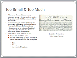
- Text too small to read easily
- Too much text on slide
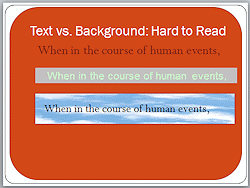
- Text hard to read against the background
- Too much revealed at once instead of line by line


It can be difficult to decide whether your slides have design errors. Exactly how much text is too much? Have you reduced the number of words so much that your slide makes no sense? Is an image merely eye candy that should be deleted or does it keep things interesting?
Irritating and Distracting
- Spelling errors!
- Too many moving things
(animated images, slide transitions, animation of slide text) - Inconsistent backgrounds and colors, transitions and animations
- Inconsistent use of upper case and lower case and punctuation
Example: Slide titles -
Our Goals
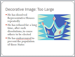
Monthly sales. - Images that waste space and don't add anything
- Theme that does not match the topic


Design Tips
So how do your avoid those design errors? What works well?
General
- Keep it simple!
- Design for primary purpose - screen, print, overheads, etc.
- Design alternate version for secondary purpose, if necessary.
(What works well on the screen may not print well at all.) - Minimize your use of tables and keep them simple.
(They are usually hard to read on screen. Include details in Notes print-out or a separate document.) - Minimize use of decorative clip art and photos. Reserve for Title slide and Section slides.
(They enlarge the file size. Too many distract from the text and take a lot of screen space.) - Insert blank slide for discussion period or manually blank the screen.
(White slide lightens the room so people can see each other.) - Do not put ALL of your speech on the slides.
- It takes 30% longer in front of an audience than when you practice alone.
- Be warned: Some pre-designed templates do not follow all of these design tips!
Text
- Keep it simple!
- Maximum number of words:
- 6 words per bullet item
- 6 bullets per slide
- 6 word slides in a row
(then a section title slide or image slide)
- Line up and match your text and bullets between similar slides.
- Be consistent:
slide background, bullets, fonts, footers, color scheme, graphs, diagrams, photos, spelling, phrasing, margins, capitalization, etc. - Summarize at the beginning and again at the end.
- 1 concept, idea, or topic per slide
- Use custom animation to gradually reveal your lists and multiple series on a graph.
This lets your audience absorb one thing at a time.
Text Fonts and Formatting
- Keep it simple!
- 1 or 2 fonts in the whole presentation.
(Vary when necessary with size, bold, italics, color.) - Font sizes: Bigger is better
- Absolute Minimum for onscreen = 18 pts
- Title font = 36 pts at least
- Bullet list = 24, 32, or 38 pts
- Font type:
- Use sans-serif fonts, like This.
- Text in a serif font must be in a larger font size to be readable than a sans-serif font.
- Use fancy fonts only for titles.
(Be sure they are readable! Be sure to transport the font with the presentation.)
- PowerPoint Formatting:
- ALL CAPS is hard to read. Use only in titles, if then.
- Avoid underlines.
(That indicates a link.) - Apply shadow to titles or terms, but be careful with text. Shadows often make normal text muddy.
(Templates sometimes shadow everything!)
Backgrounds and Text Color
- For screen: light text on dark background shows best
- For print: dark text on light background
- Mixed background: Avoid backgrounds where text falls across
both light and dark areas.
(It is hard to format text to show up well over both.) - Text Color:
- Use only a few colors.
- High contrast with background.
- Avoid red on green and green on red.
(Color-blind people will see just one color.) - For print: Avoid light colors for text to be printed on plain white background. (It cannot be read!)
- For grayscale print: Avoid colors for text and background
that print as similar shades of gray.
(Test it!)
Errors in Delivery
Even with a great presentation, the speaker can cause confusion and misery for the audience! Practice, practice, practice!
Serious Errors
- Just reading the slides to the audience (Boring!)
- Not changing slide when speaking on the next topic
- Blocking the view of the screen
- Not talking loudly enough
- Taking too long
- Fonts used are not on the computer showing the presentation.
(Can change line-up and fit of text, even running text off the slide!) - Broken links
- Too fast
= Switching slides before audience can read the slide
Irritating
- Too slow
= Same slide up too long - Wandering away from the topic
- Not making eye contact with audience
- Using a light pointer that is too small or dim to show well on the screen
Delivery Tips
- Back-up plan: Equipment fails (think batteries and light bulbs!) and presentations corrupt on your way to the event. Have a backup copy of the presentation with you and an alternate plan if all fails and you must do without it.
- Verify ahead of time:
- Equipment: What equipment will be used? Computer? Overhead projector? What are its features? Who is responsible for getting it to the correct place and set up?
- Software: What software (and its version number!) will run the
presentation? Does it match what you used to create it? If not, does it
matter?
- PowerPoint Viewer: You can use the PowerPoint Viewer to show your presentation when PowerPoint is not installed. This viewer is a free download
 from Microsoft. Version 2007 is the most recent [March, 2014].
The Office interface says that this viewer is automatically included if you use the Package Presentation for CD feature but it is NOT. Instead the 'packaging' process creates an HTML page with a link to the download. That's not what I call "included".
- PowerPoint Viewer: You can use the PowerPoint Viewer to show your presentation when PowerPoint is not installed. This viewer is a free download
- Media: How will you transport the presentation to the site? Will your presentation fit on the media you plan to use to transport it? USB drive, CD, DVD? Can the computer that will run the presentation use that type of media?
- Internet: Do you need an Internet connection? Is there an Internet connection at the site? How do you access it? Do you need a user name and password? If so, what are they?
- Handouts: Who is bringing? When to distribute to audience? Who will do that?
- Before the audience arrives:
- Check equipment: Turn on all equipment and make sure it all works, especially the hand controller. Batteries good?
- Practice: Use the actual equipment before the audience arrives.
- Adjust the room: Lighting. Arrange podium and seating for best viewing.
(Room not too dark - Makes it hard to take notes.) Lay out any handouts.
- Fonts: If using unusual fonts, embed the fonts in the presentation (PowerPoint Options... > Save > Embed fonts in file) You must set this for each presentation! Or use Package for CD and include the fonts. Or bring copies of the fonts with you to install temporarily.
- Practice, practice, practice.