
Note: This site will be taken down July 1, 2024.
Jan's Working with the Web
Formatting: Text
With HTML and CSS you can control the appearance of words and phrases or even individual letters.
The first rule is the same as for pages:
Design Thoughts:
- Keep it simple!
- Use fancy, unusual fonts rarely. Your viewer may not have that one!
- Use a font family instead of a single font and include a generic font.
- Use HTML sizes or percentage sizes for font size instead of pixel sizes.
Font and Font Family
What choices do you have for fonts for your web pages? Any font that is installed on the computer! But... since you do not know what fonts are on your viewer's computer, it is wise to offer choices. You can list several similar fonts in your style code. The browser will use the first one that it finds installed.
Separate your choices with a comma and use quotes around font names that have spaces, like:
font-family:Garamond, Georgia, 'Times New Roman', serif;
The last choice should be a generic font: serif, sans-serif, monospace, cursive, or fantasy. The browser will pick a font in that category when none of the named fonts are on the computer. Avoid using the fantasy category. It includes wildly different fonts!
Code for Font:
Old HTML Method:
Add a FACE attribute to the FONT tag like:
The FONT tag has been deprecated in HTML 4.01, meaning it will not be part of the HTML standard in the future. FONT still works... for now.
New CSS Method:
Add a FONT-FAMILY declaration to the inline, internal, or external style:
Which font to choose?
 Screen
fonts: Will your HTML page normally be read on screen? You
should use a font that is designed to be easy to read on screen. Most
fonts are designed to print well, which means they are not particularly good
on the screen.
Screen
fonts: Will your HTML page normally be read on screen? You
should use a font that is designed to be easy to read on screen. Most
fonts are designed to print well, which means they are not particularly good
on the screen.
Microsoft created several fonts (no longer available for separate download) that are tuned for screens but which print pretty well, too: Andale Mono, Arial, Arial Black, Comic Sans, Courier New, Georgia, Impact, Times New Roman, Trebuchet, Verdana, Webdings.
Many fonts come in both Windows and Mac versions.
Microsoft has a page where you can look up which fonts
come with which programs and which version of Windows![]() .
.
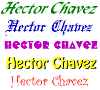
Text graphics: If you want to use a super cool font for titles and headings, use a graphics program to create text graphics, like the image of the examples above. Otherwise, keep in mind that the font you like the most may not actually be there for the viewer.
![]() Installed
Fonts: The
viewer's browser will look through the fonts installed on that computer to
use it on
your page. If the font is not installed, the browser will use one of the default fonts instead. Times New Roman and Arial are usually the default
serif and non-serif fonts.
Installed
Fonts: The
viewer's browser will look through the fonts installed on that computer to
use it on
your page. If the font is not installed, the browser will use one of the default fonts instead. Times New Roman and Arial are usually the default
serif and non-serif fonts.
Downloadable Fonts: There are some ways to download a font with your page. However, some methods only work for certain browsers. It takes extra time for a browser to download a font. Choose wisely!
- CSS3
 handles downloading fonts easily but old browsers won't understand CSS3.
Chrome and Firefox can use any TTF (True Type) font. IE9 has partial support for TTF fonts, but only if the font author set the font as 'installable'. IE 9 does understand EOT
format.
handles downloading fonts easily but old browsers won't understand CSS3.
Chrome and Firefox can use any TTF (True Type) font. IE9 has partial support for TTF fonts, but only if the font author set the font as 'installable'. IE 9 does understand EOT
format.
 Copyright
Issue: You
must have the permission from the font's creator to allow downloading. Some fonts are
free for this sort of distribution and others are notSpace issue: With CSS3 you must store the font on your own web space.
Copyright
Issue: You
must have the permission from the font's creator to allow downloading. Some fonts are
free for this sort of distribution and others are notSpace issue: With CSS3 you must store the font on your own web space. - Google
Fonts are free to use by everyone. You can download Google fonts to use on your paper documents but you can also link to fonts to use on your web sites. The web site walks you
through how to link to a specific font. (There are hundreds!) Then you just
use CSS to apply the font. This method will automatically download the font
type that the browser understands. There may be a noticeable delay before the first page that uses the downloaded font can actually use the font.
Generic Fonts:
To cover all possible situations, you should include one of the 5 generic font names in your list of fonts to use. The browser will pick a font from the ones actually on the computer.
| Generic font | Examples/Characteristics |
|---|---|
|
serif |
ex. Cambria ,Times New Roman, Georgia |
|
sans-serif |
ex. Arial, Helvetica |
|
monospace |
ex. Courier New, Consolas, Lucida Sans Typewriter |
|
cursive |
ex. Lucida
Calligraphy, Lucida Handwriting, Brush Script MT |
|
fantasy |
ex. Algerian, Curlz MT, Old English Text MT, Snap ITC |
All font names in the table above are formatted with that font. Which ones are installed on your computer?? My computer does not have Helvetica.
Which font does the browser pick?
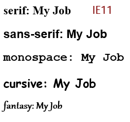
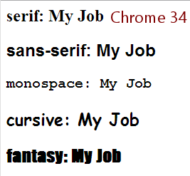
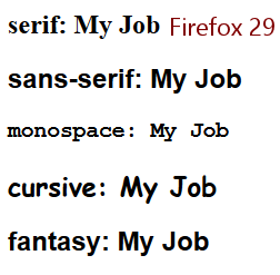
The screen shots below show an H2 element with only a generic font applied with an inline style. Can you tell what font each browser used? They did not turn out exactly the same!
![]() Customized
Browser: Most
browsers now allow the user to change the default font for proportional
and for monospaced text. So, you never
know for sure what default fonts your viewers will see. Hopefully, they have
chosen wisely for their own purposes.
Customized
Browser: Most
browsers now allow the user to change the default font for proportional
and for monospaced text. So, you never
know for sure what default fonts your viewers will see. Hopefully, they have
chosen wisely for their own purposes.
Definitions:
Proportional font: The skinny letters like i and l do not take up as much width on the line as wide letters like w and m.
Monospaced font: Each letter is the same width, like on a typewriter.
Font Size
Each font has its own natural height and white space surrounding it. In a word processor, you usually pick a point size for the text. There are 72 points in an inch. The usual size for paragraph text is 10 or 12 points . On a screen, we are not very interested in sizes in inches or points. There are several ways to handle the size of your text.
What are the sizes?
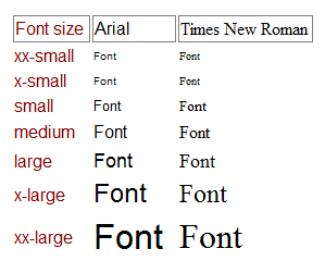 Browsers
usually have a default font size of medium for normal text.
Different fonts at medium size may be different heights on the page. For
example, in the illustration, text in Arial is consistently taller than the
same size text in Times New Roman.
Browsers
usually have a default font size of medium for normal text.
Different fonts at medium size may be different heights on the page. For
example, in the illustration, text in Arial is consistently taller than the
same size text in Times New Roman.
Sizes available:
- xx-small
- x-small
- small
- medium
- large
- x-large
- xx-large
- smaller = one size smaller
- larger = one size larger
- specific size in pixels, cm, etc
- % size
The resulting physical size on the monitor will vary with:
- font
- operating system
- resolution
For example, on a Mac the physical sizes for these font sizes are noticeably smaller than on a Windows computer. Text in a font size of x-small or xx-small may not be readable on a Mac.
To complicate things even more, most browsers let the user change the default size to suit their own monitor and eyesight.
Relative sizes:
You can use percentages to increase or decrease the text size compared to the default size. For example, font-size: 150% means "One and a half times the default size."
Code for Font Size
Old HTML Method:
Number sizes for the word sizes above. Medium was size 3. So for large text for a heading you could write:
New CSS Method:
Write a declaration in a style, either inline, internal, or external:
<h2 style="font-size:x-large;">My Job</h2>
Text Color
You can use the same type of code that you used for page color to set a color for the text
Old HTML Method:
To set the color of text to blue:
Results in: ![]()
New CSS Method:
To set the color of text, write a declaration in a style, either inline,
internal, or external, using an HTML color #rrggbb or rgb(rrr,ggg,bbb) showing the amount of red, green, and blue in the
color. For the numerically challenged, some colors can be set with names for the
colors. ![]() Table
of Named Colors
Table
of Named Colors
HTML color number:
<h2 style="color:#00ff66;">My Job</h2>
Results in: ![]()
RGB color number:
<h2 style="color:rgb(199, 55, 55);">My Job</h2>
Results in: ![]()
Named color:
Results in: ![]()
Combining Attributes
When you want to set several characteristics for your text, you can combine them into one tag or style.
Old HTML Method:
New CSS Method:
 Both of
which display like this: My Job
Both of
which display like this: My Job
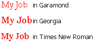
Which font face did your browser use for the text above? At the right is an image of all three named fonts at work.
By the way, Georgia is an example of a font that has been optimized for reading on screen. Do you agree that Georgia is easier to read?
| © 1997-2018 Jan Smith All Rights Reserved |
Site Map What's New |
Privacy Policy Terms of Service Copyright Acknowledgements |
~~ 1 Cor. 10:31 ...whatever you do, do it all for the glory of God. ~~
Last updated: September 23, 2018