Project 1: Word Basics
Formatting

Title: Jan's Illustrated Computer Literacy 101
Did you want: Working with Words: Word 2007,2010,2013,2016 or españolIcon: Change web


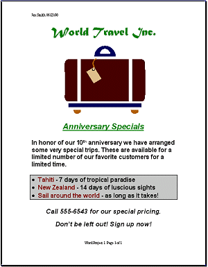
Now you can actually get to work! You will create an advertising flyer for a travel agency. You will cleverly use a large number of Word's buttons and commands to create an attractive document. The process is broken down into a number of steps, which also will introduce you to various methods of formatting your document. Follow all of the directions carefully. Save your document often!!

World Travel Flyer
What you will create


Where you are:
JegsWorks > Lessons > Word97-2003

Before you start...

Project 1: Word Basics
    InterfaceTo subtopics
    Getting StartedTo subtopics
    Format To subtopics
    icon-footprintLines
    icon-footprintWords
    icon-footprintSpaces    
    ImagesTo subtopics
    Pre-PrintTo subtopics
    Manage Printing
    Summary
    Quiz
    ExercisesTo subtopics

Project 2: Auto ToolsTo subtopics

Project 3: BrochureTo subtopics

Project 4: ReportTo subtopics


    Search
    Glossary


Formatting

The term formatting includes all of the ways that you can change the appearance of the text and of the page. You will learn how to change the font, the font size, the font style (bold, italic, underlined), the indentions for paragraphs, the page margins, the color of text and of background, and the borders.


Design Considerations

When creating announcements and other flyers, your goal is to capture the reader's attention and make them actually read the whole thing. You don't want to overwhelm the eye, however, or give too many details on this kind of document. Your basic who, what, where, when, and why will do.

In the document you are about to create, the basic goal is to get the reader to sign up for a trip with the travel agency. The bulleted text and shading emphasize the special trips that the agency is advertising in this flyer. While this flyer is not a great piece of literature, it does illustrate several design considerations, while using only basic formatting choices. Of course, a professional design company would do something much more complex and more expensive to produce, and more beautiful, too!


Design Tips for Documents

  1. Number of fonts

    Be careful not to use too many fonts. Normally two or three fonts for body text and headings are plenty, especially if they are quite different from each other. Headings can be larger, bolder versions of the body text fonts. An additional fancier font can be used also as part of a logo or letterhead without creating much of a problem. Too many fonts actually make the document harder to read. The eye and the brain are lazy about lots of changes!
     

  2. Title fonts / Body fonts

    Some fonts work well as titles but are disastrous as text. Don't get too fancy when you have lots of words to read. For something with lots of text, like a report, you want a font like Times New Roman with thinner lines and serifs on the letters. Those extra marks at the top and bottom of letters (the serifs) actually draw the eye along, making it easier to read than the plainer letters. Rather amazing, but true.
     

  3. Upper case

    Don't use all upper case letters for anything but a TITLE or SUBTITLE or an acronym (like NASA and UN). Text in all caps is very much harder to read. It feels like shouting when used in body text.
     

  4. Paper color / Ink color

    The color of the paper makes a major difference in the look of a document, even when all the ink is black. When colored inks are used also, there can be an even larger difference in the overall effect. When you complete this project, you might try printing on different colors of paper to see for yourself.
     

  5. Graphics

    The right graphics can add a lot to your document. Too many graphics in too many different styles can clutter up the page and distract the reader. Be sure each graphic is adding something and not just getting in the reader's way.
     

  6. White space

    The blank areas of your document have an important function. They are not wasted space. They function to set important information off from the details. Don't crowd everything together. Let your spaces help the reader see what you are trying to say.